
To view your links analytical data, log in to your Slimlink account and navigate to the Analytics section.
 At the very top of the analytics page, there are two panels summarizing key performance indicators for link activity and overall resource usage.
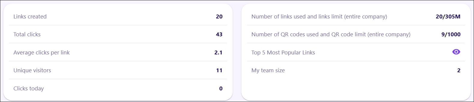
-
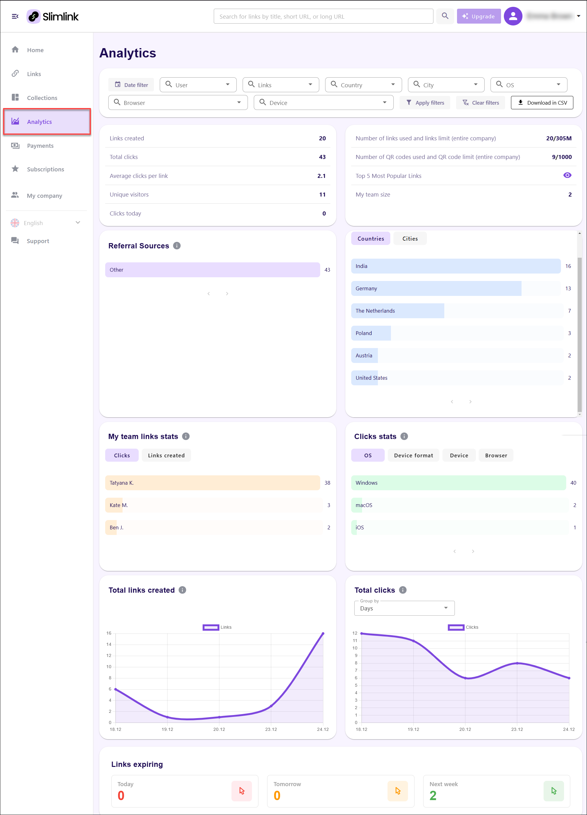
Performance Metrics (left panel): This panel displays key statistics summarizing link performance and audience interaction. This panel provides insights into overall engagement and helps track the effectiveness of link-sharing campaigns.
- Links Created: Displays the total number of shortened links generated within the system. This represents the overall activity related to link creation.
- Total Clicks: Shows the cumulative number of clicks across all generated links. This highlights audience engagement and the effectiveness of the distributed links.
- Average Clicks per Link: Reflects the average number of clicks each link has received. This metric helps assess how well the links perform on average, providing insights into audience interest and link relevance.
- Unique Visitors: Displays the number of distinct visitors who have clicked on the links. This metric reflects audience reach, distinguishing individual visitors from repeat clicks.
- Clicks Today: Tracks the number of clicks recorded within the current day. This allows for real-time monitoring of link engagement and daily performance.
-
Resource and Team Statistics (right panel): This panel displays usage data related to link and QR code generation, as well as information about team size. This panel helps track the utilization of company resources and collaboration.
- Number of Links Used and Limit (Entire Company): Shows the total number of links created by the company compared to the maximum allowable limit. This metric reflects how much of the allocated capacity has been utilized, helping manage link creation resources effectively.
- Number of QR Codes Used and QR Code Limit (Entire Company): Displays the number of QR codes generated relative to the total quota available for the company. This metric tracks QR code usage and ensures that the organization stays within the defined limits.
- Top 5 Most Popular Links: Provides access to a list of the five links with the highest engagement. Clicking the eye icon reveals the most-clicked links, highlighting the top-performing resources.
- My Team Size: Displays the total number of active team members contributing to link creation and management. This reflects overall team capacity and collaboration efforts within the platform.
Then, there is a section of the analytics page focusing on traffic sources and geographic data. These panels highlight where link traffic originates and provide insights into user engagement by location. This information helps in understanding audience distribution and the most effective channels driving traffic.
-
Referral Sources: This panel shows the origin of traffic that directed users to the shared links. It helps identify the primary sources responsible for generating clicks.
- Referral Breakdown: Displays the contribution of different traffic sources. The number of clicks from each source is displayed to the right, helping to quantify traffic from various origins.
-
Engagement by Region: This panel provides insights into the geographic distribution of link engagement by presenting data segmented by country and city. It helps track regional performance and identify areas with high interaction.
- Countries Tab: Displays the number of clicks generated from each country. The list is sorted in descending order of engagement, with the most active regions appearing at the top. This overview helps determine where the majority of link traffic is originating.
- Cities Tab: Allows switching from country-level data to city-level engagement. This provides more granular insights into local traffic patterns, helping refine regional targeting.
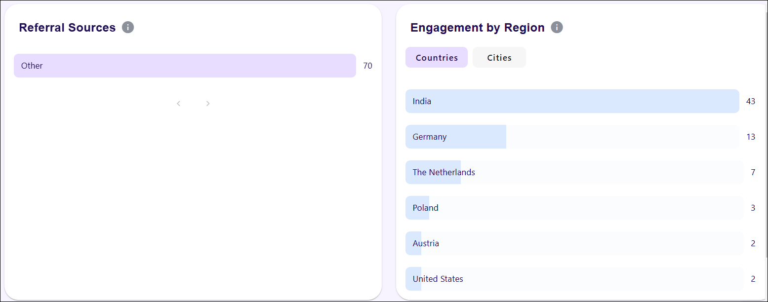
Next section of the analytics page focuses on team performance and click distribution by operating system (OS) and device format. The two panels highlight individual contributions to link activity and reveal the technology preferences of users engaging with the links. These insights help track team productivity and optimize for the most commonly used platforms.
-
My team links stats: This panel tracks and displays the number of clicks and links created by each team member. It allows for performance comparison across the team, helping monitor individual contributions to link activity.
- Clicks Tab: Shows the number of clicks generated by links created by each team member. The data is presented as horizontal bars, with longer bars representing higher engagement. This visual breakdown helps quickly identify top-performing team members.
- Links created Tab: Switches the view to display the number of links created by each team member. This provides insight into link generation efforts across the team.
- Clicks stats: This panel breaks down click data by different technological parameters, such as operating system, device type, and browser. It helps identify trends in how users interact with links based on their technology preferences.
- OS Tab: Displays the distribution of clicks by operating system. The horizontal bars represent the volume of clicks from each OS, helping track platform engagement.
- Device format Tab: Switches to display click data categorized by device format (e.g., mobile, tablet, desktop). This helps understand the types of devices most commonly used to access links.
- Device Tab: Presents click data by specific device types, allowing further granularity in analysing engagement.
- Browser Tab: Displays the number of clicks broken down by web browser, providing insights into how different browsers contribute to link engagement.
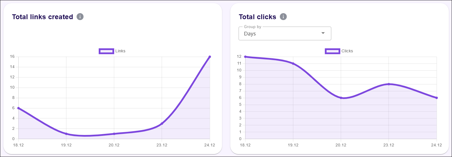
Then, there is a section of the analytics page which presents two graph panels that visualize trends in link creation and click activity over time. These visual representations provide insights into link performance, making it easier to track fluctuations and identify patterns. The panels support data-driven decisions by offering a clear overview of daily activity.
-
Total links created: This panel displays a line graph representing the number of links created over a selected period. This visualization helps monitor link generation trends and track periods of high or low activity.
- Graph Line: The line represents the number of links created on specific days, with each point on the graph corresponding to a data entry. Peaks indicate increased link creation, while troughs show periods of lower activity.
- X-Axis (Time Interval): Shows the timeline, representing days or weeks depending on the selected grouping. This axis provides context for when links were created.
- Y-Axis (Number of Links Created): Represents the quantity of links created, allowing for easy comparison of link generation across different days.
- Total clicks: This panel displays a line graph that tracks the total number of clicks received over a period. This panel offers insights into audience engagement by visualizing how link performance varies over time.
- Graph Line: The line represents daily click activity. Fluctuations indicate changes in engagement, highlighting days with the highest or lowest interaction.
- Group by Dropdown: Allows selecting how data is grouped, with options like daily, and hourly aggregation. This feature customizes the visualization to match different reporting needs.
- X-Axis (Time Interval): Reflects the date or time period for each data point, helping analyze click activity over a specific duration.
- Y-Axis (Number of Clicks): Displays the total clicks, providing a visual comparison of audience interaction across different days.
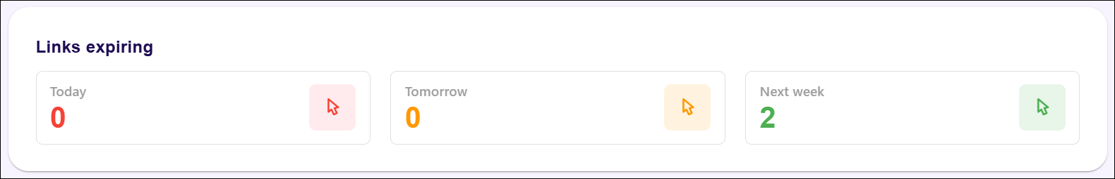
Finally, the bottom section of the analytics page focuses on tracking the expiration of links, providing a clear overview of links that will expire soon. The panel categorizes links expiring today, tomorrow, and in the upcoming week, allowing for proactive management and renewal of critical links before they become inactive.
-
Links expiring: This panel displays the number of links set to expire over three different timeframes – today, tomorrow, and next week. This panel ensures that expiring links can be monitored and addressed to maintain engagement and avoid disruptions. Each section is accompanied by a coloured indicator (red for today, orange for tomorrow, and green for next week). These visual cues help prioritize actions based on urgency.
- Today: Indicates the number of links expiring by the end of the current day. This provides immediate visibility into links that require urgent attention.
- Tomorrow: Shows the number of links scheduled to expire the following day. This section allows planning for short-term renewals or replacements.
- Next week: Displays the number of links expiring within the next seven days. This longer-term view helps manage upcoming expirations, ensuring link continuity.